Story of the Stork
Stork with a lid in the beak
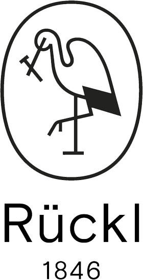
Although all products from the hand-made production of Rückl are unique, one thing remains the same since the end of 1800’s – the image of a stork with a glass-flask lid in its beak. This bird symbol was not chosen accidentally, as it represents both a bright future and new birth across many cultures. The white bird particularly became our symbol due to an intensive collaboration with medication distributors and the Antonín Rückl and Sons glassworks, established as early as 1870.
It was Antonín Rückl, the son of the founder, who first broadened the existing portfolio of the Včelnička glassworks to include glass vessels for medications, creams and liquids. Increased demand throughout the country and especially in the northern region of the republic brought an opportunity to open a new glassworks in Skalice near Česká Lípa. In 1891, the need to protect the quality production of the family Antonín Rückl and Sons brand from market competition lead to unifying our visual identity and registering a trade mark.
The symbol of a glass flask was selected as an ideal representation of medical industry packaging, as its elongated lid was frequently used for application of the contents on wounds. Along with the stork, they created both a symbol of protecting human health and, in its most poetic sense, the family cohesion of those who also embodied this brand for many years.


The stork as a timeless symbol
The Nižbor glassworks undertook major changes in 2017 and a new logo arrived as well, along with its new owner, Martin Wichterle and art direction by Rony Plesl. The logo was created by the renowned Studio Najbrt in their characteristic minimalist style. Its redesign was mostly motivated by an effort to maintain the spirit and story of the original trade mark from 1891, where the stork opens a pharmacy flask, while still meeting the contemporary requirements for maximum legibility, even in small sizes.
This minimalistic approach also affected the shape of the shield, which was replaced by a friendlier oval shape. The linear outline of the bird sustained its elegant shape, as well as the stopper in its beak, even though the pharmacy flask disappeared, along with its importance as the former main product of the company. The symbolic segment was supplemented by the company name and date, reflecting the deep roots of the glassmaking tradition of the Rückl family. The black-and-white color scheme selected references the colors of stork feathers. The stork hallmark continues to ensure Czech glass of the highest quality.


About Studio Najbrt
Studio Najbrt is a leading Czech graphic design atelier. Since 1994, it has created visual identities, books, posters, exhibitions and web sites, as well as applications for both Czech and international clients. Among their long-term collaborations are the Karlovy Vary International Film Festival, the Ambiente restaurant group, photographer Josef Koudelka, the City of Prague, the City of Ostrava and many more. Their work is characterized by a professional, distinct and often playful approach that brought them many awards and interest from worldwide professional publications. Design critic Rick Poynor wrote in 2007 that “When I think about Studio Najbrt, the first idea that comes to my mind is fun.” To this day no one has objected.


FOLLOW US
#RucklMoments